FitnessSyncer Stream
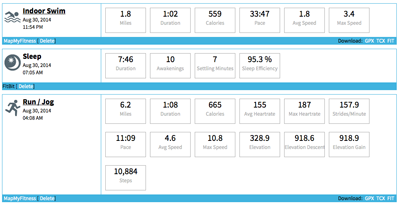
FitnessSyncer Stream shows you all of your health and fitness information in a consolidated stream view.
You may filter your data using the filter icon where you can select the sources used in the display. FitnessSyncer Pro users can also choose the types of activities they would like to be shown, such as only showing Runs, Swims, and Cycling trainings. Also, FitnessSyncer Pro users may filter by date via the toolbar’s .
Each item in the Stream will show the Key Metrics for the item. The title of the item will have a link to further information if available, which includes:
- Map of the Route
- Sleep Graph
- Graphs of the metrics, including Heart Rate, Lap, Distance, Heart Rate Variability, Heart Rate Recovery Data, and more depending on the data that came with the source.
- Split data for activities, available in 0.1, 0.5, 1, 5, and 10 mile or kilometer increments.
- Heart Rate Zones based on your Profile
- Export and download GPX, TCX, KML, KMZ, PWX, or FIT files as appropriate for the item
- For Activity items, FitnessSyncer Pro users will see charts with correlated Glucose, Temperature, and Oxygen data
- FitnessSyncer Pro users can reorder the charts and make the charts wide by selecting the Settings from the toolbar. Note that as we add new charts and data, they will be added to the end of your list.
- Share Activities
- Edit Comments, Tags, and certain metadata such as activity type, title, measurement contexts, meals, etc.
From FitnessSyncer Stream, you may also initiate the comparison of items using FitnessSyncer Compare.
You can control the imperial or metric setting and time zone of the display on the Stream on your Profile.
Heart Rate Recovery Chart
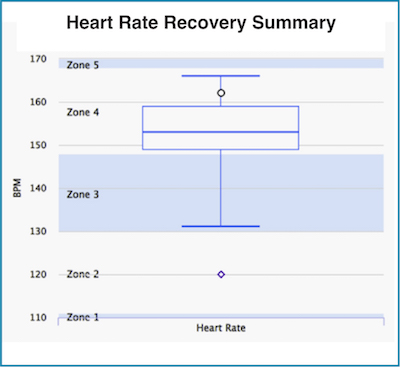
The heart rate recovery chart displays the range of your heart rate during your workout as a box chart, where:
- the bottom whisker (line) is the lowest heart rate during the workout
- the top whisker (line) is the maximum heart rate during the workout
- the box depicts the range of the 25th to 75th percentile
- the line in the box shows the 50th percentile (median)
- the more rounded dot on the chart represents the last heart rate of your activity
- if you collect daily heart rate data, there will also be a square dot representing your heart rate 2 minutes after the activity.